Cumulative Context Functions
As described in the context calculation overview, the Cumulative functions are designed to provide an easy technique to calculate the accumulation of data points in a result set. While these can be done in semantic formulas, they are much more appropriate as context logic, because they will change to suit the selections made in a report or visual - which is significantly more efficient.
Cumulative Logic
The core principal behind cumulative calc's is to read a sequence of data points in a query and easily accumulate or total the values as you move from one item to the next. Although this concept is extended to comparing to the maximum or via a rolling total, the key element is that the logic looks at the list of items (from a hierarchy) and checks the movement of data from one "row" to the next on the selected metric. By changing the hierarchy or the selections, the accumulation will change accordingly, without needing to redefine or recode the calculation itself (i.e. its contextual).
Examples
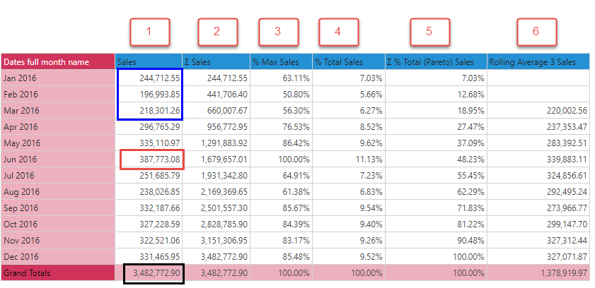
Using the grid below:
- Cumulative (2) : Adding up sales, from top to bottom, with each row representing the sum of the previous elements, column 2 is the cumulative total of salse. (notice the last value is the same as the total value for the entire column #1).
- Percent of Max (3): Each data point in column 1 is compared to the maximum value (Jun 2016) as a percentage.
- Percent of Total Sales (4): Each data point in column 1 is presented as a percentage of the total for column 1.
- Pareto (5): Each accumulating data point in column 1 (which can be seen in column 2) is presented as a percentage of the total for column 1.
- Rolling Average (6): Using a 3 item average, the values represent the average of the previous 3 elements. So Mar 2016's value is the average of Jan+Feb+Mar.

The positioning of the value chip can have an impact on how the context calculation logic is applied.
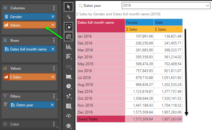
In this example, we simply have a standard sales metric by month and gender. The metric is in the "background" - not positioned on either the rows or the columns.

Changing the metric into accumulated sales and keeping the selection in the background, the accumulation effect snakes through the grid, from left to right then downwards.

By moving the values chip to the columns, the accumulation now moves downward, across the months.

By moving the chip to the rows, the accumulation moves laterally, across the genders.

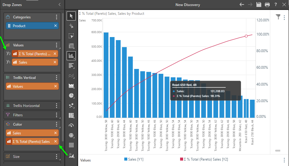
One of the best use cases for the logic is to drive a Pareto visualization.
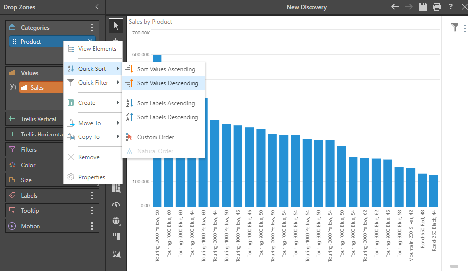
The first step, involves plotting the items you want to analyze (products in this example) on a column chart, sorted high to low

Next, right click on the metric in the drop zone, and choose Create and select Pareto from the Cumulative functions fly out. It auto adds the metric to the chart in trellis mode.

Drag the Pareto chip onto the Values drop zone header, then from the sub-drop zone fly out choose secondary axis and then spline chart. You can drag the primary metric chip ("Sales" on Y1) below the secondary chip ("Y2") - and you're instantly built a dynamic Pareto chart.
